Saturday, June 25, 2011

Graduation Card and Pillowbox

I have a quick graduation gift set for you today - I have so many graduation parties this year I may need a second job just to support them all! I absolutely love easel cards and this is a card design I came up with last year - it was the first card design I really loved and it is still my favorite!

The details:
The card size is 4 1/2 inches by 6 inches. To create the easel card I took a strip of 4 1/2 by 12 inch paper and scored it at 3 and 6 inches. This gives you your easel backing.  Then I added a 4 1/2 by 6 inch restangle on top of the scoring (adhered to the bottom part of the easel backing) which means it can then be propped up by the inside (the white 3 by 4 inch rectangle). I guess that is not really very clear without pictures - but I do know there are directions for easel cards out there.

The grad cap is from Locker Talk - cut at  2.5 inches and the pop dotted on the front. I added a brad to tassel to make it look more like a real cap. The 2011 is cut from Elegant Cakes which has some great fonts on it - cut at 1.10 inches and welded together. I embossed the mat with my stars Cuttlebug folder. For the inside I used a MS corner punch and a Studio G stamp.

For the pillowbox I used Wrap It Up and cut it at 7.5 inches which is a good size to fit most gift cards. I did hide the contour of the front - which has a cut out of a diploma - mostly because I am not a fan of the outline shape - I would rather have something dimensional. Which is why I cut the diploma out separately at 1.50 inches but with only the first layer. (I wish somone would tell PC the colors they use in the new handbooks for layers are NOT inspiring.) I also did some "Cricut surgery" and snipped off the bow part of the cut so I could use some pretty twine instead. I used some mini glue dots to attach it to the front and the same Studio G Stamp.

Here are some of the cards I made last year with different school colors to give you an idea of how you can change it up a bit. The main difference is I used Plantin Schoolbook for the font.


Happy Graduation Season!

Tuesday, June 21, 2011

Magic Kingdom Moments

Yep still being lazy - but since it is my day to post on The BugBytes I thought I better kick my butt in gear!

This is a layout for my Disney album - these are some pictures of my daughter taking in the wildlife outside of the Crystal Palace at Magic Kingdom.


The details: 

The paper I used is from DCVW Summer Dreams stack and coordinating cardstock - it just went perfectly with the colors in the pictures. I used the font on Designer's Calendar (with the shadow) cut at 1.5 inches and welded together for my title. That particular font is a hidden treasure on that cartridge   - I always forget it is there and then am so happy when I remember!

To create my "ribbon slide" I used the Tag Feature for the castle on Wrap it Up - and then I welded it to a plain tag that I rotated 180 degrees. Voila! A ribbon slide. The cut is a little more than 5 inches when it is all together. For the layer behind it, I just welded two of the plain tags together. The whole cut was another treasure I found by using my Gypsy to do a search for castles. The ribbon was a clearance find and the journaling tag is from Maya Road.

This was an easy layout to put together once all the welding was done - and I am so pleased with the way it came out. I will try once again to kick my own butt and get posting!

Monday, June 13, 2011

A quick card - that wobbles!

Yes I am still alive - just really lazy lately about posting  - easier to turn off the computer and go to bed than stay up and type! I have even been crafting - just not writing about it! I have also been shopping (my second favorite hobby!) and I finally picked up the Action Wobbles everyone has been raving about. Michelle on the Circle MB was a doll and sent my daughter a project with one - once I saw them in person I knew they had to be mine. (yes I am easily amused) This is a quick card I made for my godson who was having a Scooby Doo party.

And look it wobbles!


The details:

These cuts are from an oldie but goodie Everyday Paper Dolls. The doghouse was cut at 5 inches (I think - way too lazy to go get that Gypsy right now) and I welded it together to make the card. I forgot to flip the image though which resulted in a head smack moment  - fortunately the shape was pretty forgiving. The doghouse has no layers so I cut it again in black and did some hand cutting to make the layers. The dog is cut at around 3 inches with the top layer in kraft paper and the blackout layer in black. I also inked the dog to make his features stand out and added some pink chalk for the cheeks.

Then it was easy peasy to add the action wobble to the back of the dog and the front of the card. And voila -  wobbly puppy! I finished it off with a studio G stamp (ignore the crappy stamping job - just pretend it is not there). I think in the end I was probably more amused than my godson but I am okay with that. I promise to try to be more diligent about posting - and I have some cute baby stuff in store!

Sunday, May 22, 2011

Crystal Palace Shaker Layout

As I was working on this next layout  I found the Mickey confetti I had saved from our table at the Crystal Palace and wanted to incorporate it into the layout. After all, I thought why should shakers be just for cards??

The details:

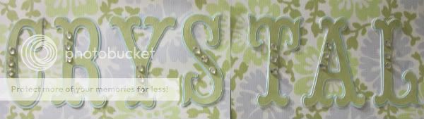
The paper I used was from K and Company, and I used Storybook for the title and cut with the coordinating plain papers from the same stack as the print. The title was cut in green and shadowed with blue but I just was not happy with how plain they looked - and then it hit me! The "Crystal Palace" needed crystals! And since it had been so long since I used my I-rock I apparently forgot what a huge PITA it is, I busted it out. Eleven hours later (not really but it felt like it) I was done adding the bling and (since I am a glutton for punishment) I added it to all the photo mats too.

Here you can see the bling in the photo mat corners and in the pic you can see the confetti I used for the shaker part of my layout.

To create the shaker element I used the same welding technique I used in this post. It is basically a frame made using some rectangles from George and the silhouette cut of the Mickey shape  from Mickey Font welded together. I used a blank frame behind it so you could see the background paper. The plastic is recycled from a package of plastic easter eggs.


I used a double layer of foam tape to give it more dimension than my shaker post-it holders, and you can see from this picture how it is popped up.


So even though adding the bling was more time than I liked to spend on one project I was super pleased with the way this came out and I was able to incorporate our souvenir confetti right into the layout. I guess sometimes the extra effort (and swearing) is worth it!

Saturday, May 21, 2011

Simple Swiss Family Layout

Today's layout is really simple but I am still pleased with how it turned out. I think because it is so simple you can pay more attention to the pictures. This was our trip up into the Swiss Family Treehouse at Magic Kingdom.


The details:

This is the first time I used the Blackletter font which came free with the Gypsy download - when I was looking at these pictures and thinking about this layout it was my first choice.


The letters are cut at two inches and I used paper from the DCWV Ultimate pack (which had samples from 10 of their lines - and  the plaid is also from there ) . I shadowed them with a beige paper because I was sort of going for that "carved in the tree" look. I believe the background paper may be from a package of paper I got at Big Lots. In an effort to use what I have (a shocker I know!) all the photos were matted with paper from an old DCWV mat stack - so old I don't know what it was because the cover is long gone but the paper complemented the rest of the papers perfectly!

i hope you aren't tired of the most magical place on earth because there is more Disney ahead!


Thursday, May 19, 2011

Disney Safari Pages & A Mini Giveaway!

I promised I would get back to layouts and here we are! I have been diligently working on my Disney album, and what works best for me it to plan ahead. I spent about a week putting together sketches with pictures and paper so I was prepared to attend my last all day crop and be productive! And I was - eleven pages done and in the book! Only a million more to go....*SIGH* it just feels that way sometimes! These are some pages of the pictures I took on the Kilimanjaro Safari at Animal Kingdom.


The details:

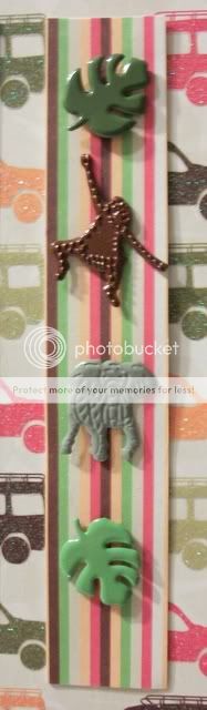
For these pages, I used DCWV Safari Kids stack, which I just picked up recently and absolutely love! I used the Zoo Story Lite cartridge for the title :

I used vinyl to cut out the "Kilimanjaro" because at 1 inch I knew they were going to be a pain to cut and adhere if I used paper! Vinyl made it a cinch! The Safari is cut in the font with the Shadow at 2.5 inches. I know it may be hard to see on the picture  of the layout but in the corner I used a spare strip of paper decorated with some brads from Eyelet Outlet. They have the cutest brads and I am totally addicted!

On the second set of pages I used my Cricut for the film strips. That cut can be found on Mickey and Friends, and I used by Gypsy to hide contour of the inner cuts so that I could place my pictures there instead. Then I welded two of them together slightly overlapping and cut as one long strip. The side one is cut at 3 inches and fit five 2x2 pictures. The larger strips were cut at 5.5 inches and I moved the cut over to the side of the page to cut the strip on the leftt, then cut it as a whole for the right page. The letters are not Cricut (*gasp*) they are chipboard with a wood grain font on the front.


I do have some extra letters that I cut out - the word "safari" in the Zoo Story font (without shadow) at 3 inches - once in the cheetah print and once in the gold cardstock - and they will go to the first person to email me about them! Only seven more pages to write about!

Tuesday, May 17, 2011

More Teacher Gift Ideas

Hi everyone! Happy to be once again at TheBugBytes today! While Teacher Appreciation week is past, I thought I would share these altered mini chalkboards with you in case you were looking for a nice end of year treat! I made one each for her music, art, and PE teachers. I found them at ACMoore for around a dollar apiece - with some vinyl, paper, mod podge, and some magnet strips to the back and they turned into great gifts!


The details:

For all three I used my gypsy to plan out the sizes of the lettering and shapes. I set up Layer 1 with two rectangles in the same measurements as the chalkboard and used the subsequent layers to plan each board. The names are in vinyl to make sure they stick while I used paper for the shape cuts.

The music teacher's board I used Hannah Montana for both the name and the cuts.I nudged each of the letters together some more on the Gypsy so that it cut as one piece and wasn't too long. And yes, it was as big a pain in the butt to weed and put on there as it looks! But I was very happy with the results.  A closeup of the music notes:

I cut them using DCWV new Performance stack which I just love, and then applied a thin layer of modpodge to the top and the back edges that hung over the sides.

For the art teacher's board I used Hannah Montana again for the font, and while I was not crazy about that color vinyl, my daughter had veto privileges and she liked it. The brush and palette are from Locker Talk  - I am really trying to use my older cartridges and find those hidden gems! I used stickles instead of cutting the paint circles, and added some to the brush. I think it came out really nice! (and you can modpodge over stickles in case you were wondering like I was) A closeup:


Now the PE teacher chalkboard has a story connected to it - I asked about the teacher and was told that she was "really really sick - she's been out for a looooooong time - I am worried about her Mommy". Well, after a quick call to the school secretary I discovered what I had suspected - she was on maternity leave! But the secretary didn't remember the name of the substitute so a generic "sporty" theme chalkboard had to suffice!

I used Car Decals for the font, and Sports Mania for the 4 corners - another oldie with hidden gems! The cuts already had the corner shape built in so I knew that it was Cricut fate! I went into a little more detail on the different shapes. I used the Cuttlebug mesh folder on the football and basketball, and inked the baseball and soccer balls. Some closeups so you can see what I mean:


I also loved the way they turned shiny after the mod podge! I did get good feedback via thechild (although now I wonder about her school stories) so I hope they liked them. We shall be back to the layouts soon!