The details:
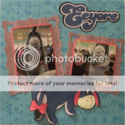
This is another layout that started life as a sketch. This time I took a picture that included my notes as I planned the layout. Actutally I am just now noticing that I had thought to add flowers to this layout but that didn't happen. See? I told you I can't stick to a sketch or even my own notes.
Eeyore is cut at 4.5 inches and I decided to attach Eeyore's tail with a brad instead of just gluing it on - so it could swing back and forth if I was so inclined. The title cut is 2.50 inches.
Once again I used Elegant Edges for the photo mats. The square mat is Hearts2 on page 41 cut at 5.40 inches and the other is Hearts 2 but the Oblong feature cut at 7.00 inches. I decided the pictures need a little bit something more to stand out so I matted them on the pink paper before adding them to the larger mat.
The printed paper is K and Company, the purple from the Floral Dreams stack and the turquoise from the Life's Little Occasions stack. The other papers are Recollections cardstock. More Disney to come!


I love Eeyore!! Your layout is so adorable!
ReplyDeleteWow! What a perfect layout. Your colors and your Eeyoure just make it! Stop making me want Elegant Edges!
ReplyDeleteSuper sweet pictures, BTW.
Oh I just LOVE Eeyore ! And your layout is awesome too. And thanks for the enabling...I really want Elegant Edges now.
ReplyDeleteOMG, is that cute or what?!?!?! Love it!
ReplyDeleteI absolutely love your layout! Eeyore is my most favorite of all Pooh Bear characters!
ReplyDeleteThis is just the cutest layout! Just found your blog through the "pledge post" on the Circle MB and became a follower! Look forward to visiting with you!
ReplyDeleteSuch a cute idea to use a brad to attach the tail. I love the layout.
ReplyDeleteVery cute, going to need to get Elegant Edges. I can't stick to a sketch either so I gave up :-)
ReplyDeleteso sweet! :) www.sweetsassydiva.com
ReplyDeleteDon't keep tempting me with Elegant edges. I have to go on warpath with damask or reminisce or lacy labels.
ReplyDeleteYour layout is lovely. And you atleast made a sketch and followed it 80 - 90%. I never make a sketch lol. TFS
Your layout is so cute! Eeyore looks great, I love the brad holding on the tail!
ReplyDeleteOMGOODNESS... Your layout came out soooo cute! TFS! :o)
ReplyDeleteTheresa
what fun Disney layouts lately. Great work.
ReplyDelete